System v3.0 Public Release
IDENTITY
The visual operating system of Fritex.
Precision. Performance. Future.
Designed for the impossible.
Fritex is not just a manufacturer; it is a problem-solving engine for the most extreme environments on Earth.
Our visual identity reflects this engineered nature. We prioritize high contrast, technical typography, and a "HUD" aesthetic that communicates data and precision instantly.
SPECTRUM
02TYPOGRAPHY
03 Inter_Variable.ttf
The quick brown fox
H1 - Bold - 48px
Jumps over the lazy dog
H2 - Bold - 30px
Inter is a typeface specially designed for user interfaces with focus on high legibility of small-to-medium sized text on computer screens.
2,500+ Glyphs
100% Variable
ASSETS
04Photography Mood
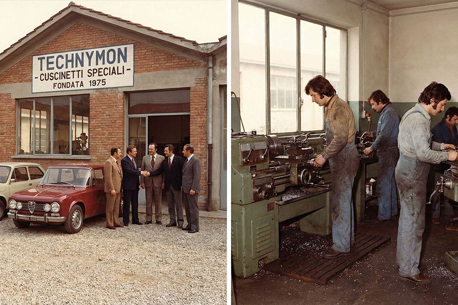
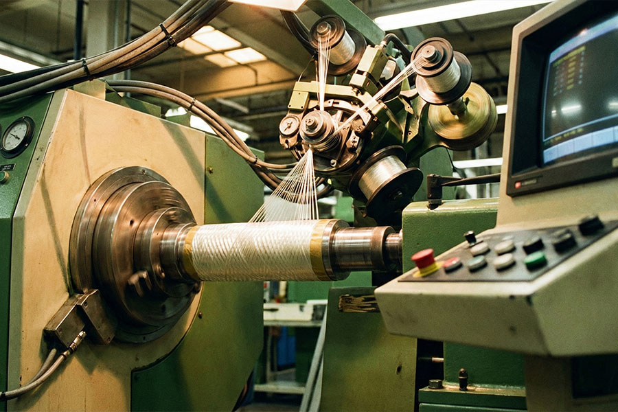
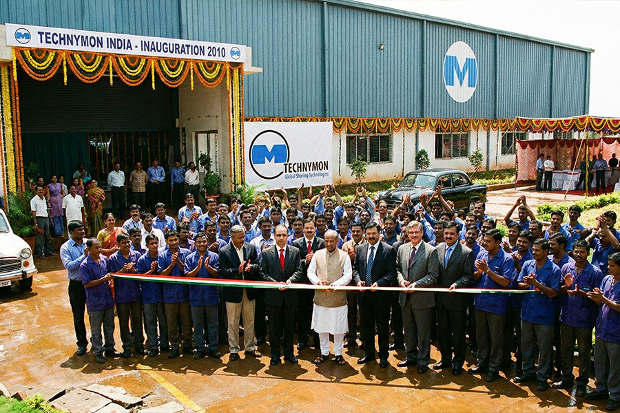
High Contrast
Industrial
Technical
Industrial
Technical
System Icons (Lucide)
We use the Lucide React library. Icons should be used with a stroke width of 1.5px to match the typography weight.